....hey, atleast its confirmed to be Mature, unlike the speculation of it being Teen.
So, Like it, Hate it, or Meh-tastic?
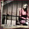
The only thing I don't like is the empty space surrounding Cheryl, other than that, it serves its creepiness....
Moderator: Moderators


Actually this is what this cover reminded me of (SH4). I have mixed feelings about this cover but while it could've been improved it's not terrible either. Might've gone for something more subtle (SH2 Xbox cover maybe). But hey I'm getting it because of the game not the boxart.Whitney wrote:It's okay, I think Cheryl could have been incorporated more into the background though... right now she looks like she just floating there but I think it's leagues better than the US SH4 cover!